As anyone knows who has been dropping in on any of my websites recently, I’ve been spending a lot of time carving recently. Most of this, and the concurrent thoughts and observations, have been turning up on my Endangered Alphabets website; but I’ve also been wanting to write about the carving-and-painting process itself, as distinct from the Alphabets.
Over the past week I’ve been working on a piece for a supporter of the Alphabets–a piece that takes as its text a piece of calligraphy in English. I promised I’d document the process for him, and this seems like the perfect opportunity to write about the woodworking aspect of this unexpected new passion of mine. It’s an aspect that is, in its own way, just as interesting as the Alphabets aspect. Here goes.
The work proper–that is, the work with the wood–begins when I get home from Kinko’s.
The staff at Kinko’s, where I take my text and enlarge it to carvable size, have been one of my two sets of constant companions and collaborators ever since I began this carving phase of my life. The other is the gang at Sterling Hardwoods, where I get most of my wood.
I have loved office supplies ever since the days when I was about ten. My brother and I had to kill time in my father’s office, and were fascinated by the trombonerie of paper clips, the gluey tang of Sellotape, the surprising brutal grip of bulldog clips. I have loved the smell of lumber even longer, since I was about six, when my father once took me one a wood-buying trip–which is odd, because I can’t recall him ever building anything with wood.
But I must confess an equally strong and much more guilty pleasure, especially on my visits to Sterling: the fact of being recognized and accepted by people who work with their hands.
Growing up as a top-of-the-class little boy in a family that kept moving, I was always in danger of being isolated and friendless, and as I moved through my teens it steadily grew on me that in a practical, everyday way, people who work with their minds rather than their hands have a kind of uselessness. My father couldn’t repair his own car; nor could my brother or I. This struck me as a kind of class weakness. My whole life I’ve admired people who can build things from scratch or fix them when they break, and wished I were more like them.
Somehow my daughter Maddy, now sixteen, has intuited part or all of this. Last week I told her with embarrassed excitement that I’d just come from Sterling, where the shop guys surprised me by saying, as I walked in, “Oh, we were just talking about you.” Turned out they were unpiling some stacks of wood that had been leaning against a wall for, well, possibly several years, and they came across a piece of cherry with grain like a hurricane seen from space, an equally stormy piece of mahogany and a plank of ash with a broad, vivid ripple like the beach at low tide. “We saw these and immediately thought of you,” Dave said. And Jeff pulled out a piece of red birch he had been saving, but, as he said, “I like what you do with the wood.” All these pieces were now in the back of the car, and I was as happy as…um…as happy as my father with a map in his hand.
Maddy got it at once, and her eyes lit up. “You’re a regular!” she grinned.
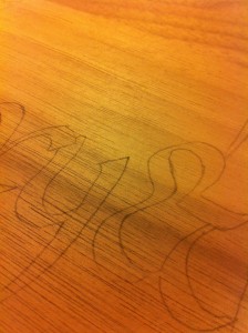
So the process, moving from extravert to introvert, begins out in the world and moves into the home, starting with gifts from the world: the photocopy from Kinko’s and the wood from Sterling. Those, plus carbon paper from Staples, result in the first appearance of the text on the wood–the outline, the sketch, of what is to come. An idea made visible.
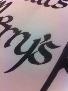
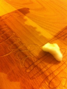
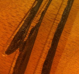
Meanwhile, something curious has happened to the text. Generally I use a cheap blue ballpoint pen to outline the text to carve, sometimes filling in the entire letter or character. As I was making the original Endangered Alphabets series, I noticed a remarkable, almost miraculous transformation taking place during this step. When light shines off it, the blue ballpoint ink turns gold. If I rub over the entire text, the photocopy turns into a text in gold leaf.
At this point I take a pencil–never a mechanical pencil: the sheer fact that an ordinary pencil is made of wood and ore turns it into a kindred tool–and clean up the text to be carved, filling in sections I missed or traced clumsily. It’s just the first of many steps that try to make up for the mistakes I’ve just made. The entire process is as humbling as it is ambitious: it’s as if I’m in a race against my own faults, and often I won’t know until I reach the finish which of us has won.
Then it was time to start carving. This is the part I imagine when I think of starting a new piece, and on this particular occasion I’d been especially looking forward to it because the client had asked for walnut. I thought the walnut was a mistake: wouldn’t it be too dark for the black lettering to show up? The client was firm, though. Sterling actually had no walnut in stock, so I went to another wood shop–before work, at 8 in the morning, I was so eager.
When I thought “walnut,” what came to mind was the burled walnut used for the dashboard fascia of classic British saloons and sports cars, such as the Jaguar XK 120—not only a nice complex brown but also complex in its grain, like stirred coffee with plenty of cream.
When I actually started picking through racks of walnut planks, though, the walnut was actually lighter than I’d expected, and was frankly a bit unexciting. It looked like a regular white wood that had been lightly smoked. Not much color, nothing interesting in the way of grain.
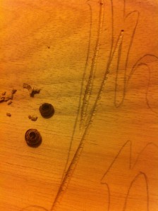
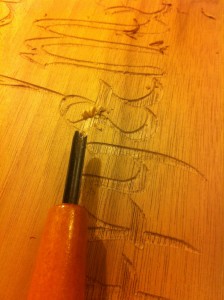
When I made the first incision–the language of surgery seems entirely suitable here–I had a terrible shock. My favorite wood to carve is pau amarillo, or yellowheart: it’s like carving very firm butter. At the other end of my scale of preference is paduak: spectacularly beautiful, paduak is a disaster to carve, its fibers so brittle it’s like carving a large flat orange-colored sugar cube. Walnut turned out to be exactly like paduak, but without the spectacular color. My heart sank.
Okay, time to buckle down and deal with it. With a wood this brittle, disaster is most likely to strike when you’re making a curve that starts across the grain, then rounds to run along the grain, then continues round to cross the grain once again. At an almost microscopic level, the wood can shatter—a break that may be only half a millimeter across, but that’s the thing about a curve: curves are so deeply hard-wired into our sense of visual right and wrong (that is to say, of beauty) that the slightest error is immediately obvious. And here’s the thing about writing, especially this particular script: almost every single letter involved such a curve at its rounded bottom. The cursive English script is a series of center-of-gravity toys or verbal ornaments that rest, like Weebles, on a curve to which the ruled line is a tangent. Every letter of every word was a walnut trap. I picked my sharpest gouge and moved as smoothly and slowly as I could.
Ironically, things went wrong when I should have been safe: cutting vertically down across the grain, making the simplest letter imaginable—a lower-case L—I hit a weak spot in the wood and a whole chunk snaps out. The wood is as brittle in terms of depth as it is horizontally, and almost nothing is holding this surface together, dammit. I’ll have to paint the letter as if the line was unbroken and hope our love of pattern, our habit of seeing what we expect to see, will trick the eye. A good woodworker, I tell myself, will see the blemish. A good woodworker would know how to fix it. A good woodworker wouldn’t have made the mistake in the first place. I know these doubts are probably not true, but carving walnut is like playing golf: you are your own opponent.
So why is it that when I look forward to making one of these boards, it’s the carving I look forward to? Why is it I sum up the entire process by calling it “carving,” rather than, say, painting? Is this the phase that I most enjoy?
I actually found myself asking these questions as I was working. If this is such a high-stakes game, a silent drama of controlled anxiety, why do I like it? Why do I do it?
Well, the short I answer I came up with (and if I sound surprised, it’s because this woodworking is so different from anything I’ve done before, and I never thought of my writing in this way) is that I appear to love making beautiful things and then, in most cases, giving them away. So much so that as soon as I’ve finished one and packed it up I feel a pang of loss, not just of the product but of the process, and I can’t wait to start another.
But that word “beautiful” seems to beg all kinds of questions. How is this different from writing? Is it more like playing music? At what point do I start seeing beauty in a process that could easily be just a series of rather routine tasks? And these questions, frankly, are what drove me to watch what I do rather more closely, and to write about it.
First, to back up for a moment: the beauty begins with the wood. My debt to Rick Davis and the luthiers I followed in writing Guitar is that I love a piece of good wood—love it admiringly, love it avariciously, can’t wait to buy it and do something with it. And this is a wholly egoless beauty: part of my peculiar love of this art or craft of mine is that so much of the appeal of the finished item is something I can’t boast about: if all I did was slap a couple of coats of polyurethane on some of these pieces of wood, people would still gasp. Seems to me all I’m doing is respecting this peculiar complex patterning of the grain, its warmth and color, feeling in it a connection to all the forces, visible and invisible, in the universe.
This stage involves one of the first distinctly satisfying moments of the whole process, though it’s by no means a given. If I am not trying to rush, and I’m not fighting the wood or the gouge, then every so often I make a perfect curve. The first few times I did this, I was looking at the line described by the tool; after a while, though, I began to recognize the curve by the steady pressure in my right forearm muscle; and what began to emerge was an understanding of the physics of writing.
A perfect curve is the result of three forces in balance. The cutting motion is always a tension between the forward pressure exerted by my right hand and the restraining pressure exerted by my left hand; a curve adds the outward motion of my right elbow. (Whenever possible I curve left rather than right.) In mathematical terms, the X and Y axis.
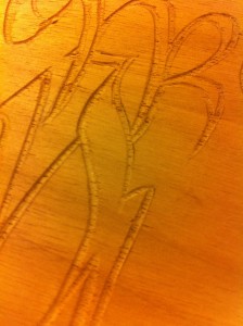
If the outward movement of my elbow is anything less than continuous and smooth, the curve stops and starts, has flat stretches or awkward jags. The perfect curve, then, has a kind of Zen about it: it the outward manifestation of inner balance. This particular script, designed by a calligrapher, is all curves, the curves of the pen translating into the curves of the gouge. I become very fond of it.
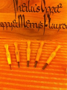
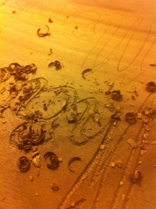
Once I’ve carved the outlines of the letters, I use a broader gouge, sometimes two or three different gouges, to hollow out the rest of the letter. This script had plenty of strong, narrow verticals, so I went across the grain and took out the marrow, so to speak, but whenever the letters were chubby enough I used a different approach. Cutting across the grain of a highly granular wood such as walnut leaves a rough, bristly surface. If possibly, I like something smoother, so I use the broadest tool possible and go with the grain.
Even here, though, there’s a catch. I discovered the first time I worked with cherry that even going with the grain involves two opposite longitudinal directions. I don’t know the botany of the situation, but the wood grows in such a way that carving with the grain in one direction is like stroking a cat’s fur the wrong way: the cut surface is fibrous and prone to tearing, and the tool very easily dives in too deep, leaving an ugly, ragged woody crater.
Going the other way along the grain, though, is one of the pleasures of carving: it produces a smooth, almost waxy cut surface. The broad, flat gouge seems almost to polish the wood as it cuts. I never know which way is right except by trying, so I test the walnut this way and that, and discover that I want to be cutting horizontally left to right, the way the text reads. I turn the board around and take out innumerable little slices. It must look weird, I think, when the pen rose and fell in the act of writing, to be cutting across the letters, but that’s the wood’s contribution to the act.
Next I seal the cut letters with a light coat of polyurethane. Early on in my project I discovered the paint was seeping into the cut fibers at the edges of the letters, leaving a furry outline I hated. With most woods, nowadays, I automatically seal before painting, though even here is a balance: too much polyurethane and the paint won’t stick. An ideal wood is one that is naturally oily, and seals itself—another reason I love pau amarillo.
Painting is all about light—not the way the Impressionists thought of light, but light as a means of defining an edge. It took me ages to work out how to position the wood in relation to the desk lamp so the shadow of the cut edge defined where I should paint, and where to stop. It’s one of the reasons why smaller projects are easier that large ones. My big Endangered Poem Sculpture has four faces, each 5 feet tall—impossible to move easily. I wear out my neck moving the lamp and straining to see which angle of light gives me the clearest shadow for the quarter-inch section I need to paint next. With this project, I hold the walnut board on my open left hand, like a painter holding his palette, and rotate and tilt at will.
By and large, I paint one side of every letter first, so the angle of the light is just right, and turn the board around and paint the other side. The painting often takes a lot longer than the carving, especially if the letters or characters are narrow. I don’t like the smell of the paint, which is also a bear to use: it clots on the brush, and every 15-20 minutes I have to put the top back on the can, go into the kitchen and wash the brush, which takes longer than I wish it would. Then I have to shake up the can so the surface that has been oxidizing and evaporating is mixed back in with the rest, and only then can I carry on.
Once again, I’ve experimented with different brushes, with adding paint thinner, with pouring gouts of paint into the larger letters from a spoon. In the end, I’ve concluded that it’s a pain in the ass and I have to accept it as part of the cost of living in this medium.
On the second pass through the letters, everything changes. For the first time, I’m creating finished shapes. Nothing illustrates the human penchant for pattern-recognition more clearly than the fact that within seconds of turning the board around, the level of satisfaction, pleasure, even excitement changes. Even when I’m carving one of the Alphabets and the shapes of the characters mean nothing to me, semantically or phonetically, they manifest unmistakable intent. I say in my talks that their appeal is like seeing Stonehenge for the first time: we have no idea what those stone circles mean, but they clearly mean something. And from now on, whatever happens, I have made something.
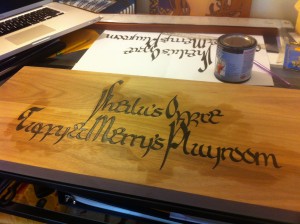
Painting done. The text is upside down because the final pass through the letters touched up the right-hand edges, the bottoms of the curves--easier to see and paint with the board upside down.
Easily the most ecstatic chapter in my book Guitar is the one describing the moment when I first saw my guitar-to-be after it had come out of Pete Langdell’s spray booth. The spray booth is where instrument-makers apply finish under closed conditions that mean they’re less likely to get ghastly diseases from the toxins in the finish. You and I apply finish by hand, using a foam brush, but the instant of transformation is just as dramatic. I took the carved and painted board out to the garage, laid it across the handle of the rusted-out Garden Way cart that acts as the dolly to transport my Alphabets trunk out to the car and back, and stroked on the polyurethane.
This really is a moment of supreme pleasure. The finish needs to go on smoothly but lightly, and the stroking motion is beautifully fluid; it’s yet another way in which the creation of these pieces is something you feel deep in the muscles. But within a second of the urethane wiping across the wood, a multi-dimensional change takes place. The wood acquires both luster and depth, as if rising and sinking at the same time. Faint shadows become deep currents. Knots becomes cyclones. The grain ripens one way, but in the same instant a different set of ripples will often appear running perpendicular to it. The wood becomes anatomical, muscular. And the black text seems to float both in and above it, a human pattern echoing the infinitely wiser, older, more complex natural pattern.
Once again the walnut startled me. It still didn’t look like the fascia of an XK 120 Jaguar, but all kinds of subtle colors had emerged from the background. Hints of nuttiness, to be sure, but also unexpected overtones of plum and mulberry. I felt like a wine writer.
There’s more to the process, but everything from here on in is just a kind of fussing around the edges. The finish has to dry and be sanded and rubbed in again, this time by cotton ball, and I often bring the still-wet board into the kitchen and turn on the extractor fan above the stove, my own domestic fume hood. All kinds of tiny glitches show up and need to be coaxed or bullied out of sight. The fumes will still be breathing for two or three days, so I can’t yet pull out the roll of bubble-wrap.
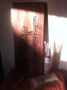
In a way, though, this is my favorite time, because for those 48 to 72 hours the piece stands around the house—sometimes on my desk or side table, sometimes propped up in undignified fashion next to the heating vent—and I get to admire it. And here’s the odd thing: it doesn’t feel as though I made it. It feels too astonishing to be within my skills; plus it has qualities that had nothing to do with me, such as the text or the wood itself. The piece has transcended its materials and its maker.
The only piece around here that feels like mine is a Balinese symbol that I got wrong and should have had an extra swirl, so it’s going nowhere.
I keep it as a reproach: this is what not to do with a piece of wood.
A final word: you may be wondering what the carved text says. It says “Sheila’s Office/Tuffy and Merry’s Playroom.” The language is English, the script Luxeuil, a monastic hand developed in the eighth century by the monks of Luxeuil Abbey, at the time one of the largest monasteries in Gaul.
The gentleman who commissioned this piece, who wishes to remain anonymous, wrote: “Even the most banal text can be presented beautifully…. Luxeuil only lasted for a few decades, the tension between beauty and speed of execution doomed it. However, it is one of my favourite scripts – I use it all the time.
“Once in a while I give a demonstration and teach a class at my wife’s school (she’s a 4th grade teacher). The children are entranced and all want to learn–especially the left handed ones: I am myself left handed and had to learn to make the signs (that’s how I explain it) with my right hand in order for the letters to come out right. When the flow is good, making the letters is making music with ink on paper. You make a comment on your site about gold leafing and feeling like a monk. I think that’s exactly right and true: this work is a meditation.”

Related Articles
2 users responded in this post
Your writing about the experience of carving makes me think that you must have been a cellist in another lifetime.
Blimey. I think that’s the greatest compliment anyone has ever paid my writing.
Leave A Reply